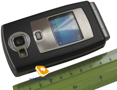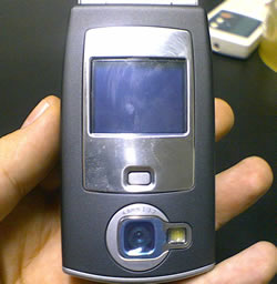
Nokia is not known for its clamshell handsets, but the company does occasionally make a foray into that world, and has done so with the N71.In fact, despite Nokia’s reluctance to flip, there is already a clamshell handset in the N range – the N91. Where that is a very chunky beast, with a camera in its own clamshell independent swivelling section, the N71 has a rather more traditional clamshell design, being made in just two pieces, and hinged at its top edge.The front screen offers just 96 x 68 pixels of viewing area and, a relatively limited range of features. It will show the handset status and the current time, and when you are playing music a button underneath the screen will pause and resume. But you can’t switch between tracks or fiddle with volume without opening the flip.
Design wise Nokia doesn’t seem to have really taken the full potential of what the clamshell format offers on board. Let’s start with the overall size, shape and weight. The N71 is thicker than the popular candybar N70 - the other Nokia handset I happen to have handy as I write. With the clam closed it is almost as tall, and it is heavier. Compare for yourself: N70 53 x 109 x 22mm, 126g; N71 51 x 98 x 26mm with the flip closed, rising from 98 to a shade over 180mm tall with the flip open and 139g.When you open the flip there is room for a decent sized screen and for large, well spaced keys. What does Nokia provide? A screen which is nicely specified in terms of pixels – 240 x 320 of them – but a mere 2.4in diagonal in size. I’d have liked to see it larger.
The keypad is the bigger disappointment, though. The number pad and control keys are separated by a design feature – a slightly curved indent in the casing which to my mind just consumes potentially useful space.There are several things I just don’t like about the keypad design design. The softkeys are a long way from the softmenus they map onto, and while you will get used to this it is a little disconcerting at first.The navigation key sits in the centre of a familiar group – Call, End, and those softmenu keys. It could easily be a third larger, and its raised select button feels only OK under the fingers. The whole thing needs an element of digit-precision to use effectively.
The N71, yet another handset in the N range of multimedia rich phones, is a flip (or clamshell) phone. Nokia doesn’t do these very often – the 3G N90 with the Carl Zeiss camera lens and the non 3G 6131 are the two most recent examples, but they are mere droplets in the vast ocean of Nokia handsets. So we had somewhat baited breath waiting for the N71 to land on our desk.
When we took the N71 out of its box, our first reaction was raised eyebrows. ‘Are you sure this is a clamshell?’ we asked ourselves, and exclaimed, ‘it’s huge!’
As we see it, the plus points for clamshell phones are: they are small and so ideal for tiny pockets; they look cool as they have a smooth opening mechanism and are easy to open one-handed; just as with sliders, you can control a lot of features without opening the handset; and inside there is room for a large screen and a big keyboard.
Nokia does not agree. The N71 is vast – 98.6 mm tall, 51.2 mm wide, and 25.8 thick. At almost 10cm high, it is a rival for Nokia’s solid candybar performer the N70, for example. The size matters because it means you are likely to need two hands to open the flip, and this is particularly annoying because Nokia hasn’t built any spring-loading into the mechanism.
It is also irritating because when you do open the N71 what you find inside is a reasonably small screen. At 2.4 diagonal inches it is actually a pretty good size for a mobile phone screen, but it looks a bit lost in its large surround, and nowhere near fills the available space. And the chunky-fingered, who often like clamshell handsets because they afford space for a larger than usual keyboard will find rather smaller number keys than they might like inside, and a wodge of ‘dead’ space occupied by no keys at all.
While we are carping, let’s talk about build quality. Many phone manufacturers are going for new looks and new ideas. Shiny back and touch sensitivity in the LG K800 Chocolate, un-phonelike looks and controls in the LG U400, smooth lines in Sony Ericsson’s W900i. Nokia has chosen, by comparison, a rather plasticy and low quality feel for the N71. Go figure.
Back to the front for a moment (to coin a phrase). The front screen is pretty small, surrounded by a large frame of shiny silver. It isn’t all that capable. It shows the handset status and the time, and a single button beneath the screen will pause and resume music. But you can’t choose tracks using this button.
Nor can you start the main, 2 megapixel, camera, whose lens sits on the front of the clamshell case, running with the handset closed, which means you are a bit hampered when it comes to shooting quick snaps. We are quite used to seeing front screens on clamshell phones doubling as viewfinders, so not having that option here makes the N71 feel a bit dated.
Well, the music playback quality is great. You’ll need to store tracks on a miniSD card as there is only 10MB of storage built in, but you get a 128MB card with the phone to get you started. And another plus is that while the headset connector to the N71 is Nokia’s Pop-Port, you get a converter to a 3.5mm jack so you can use your own headset if you prefer it to the one Nokia provides.
We also like that infra red is built into the N71. Bluetooth is here too, of course, but we find infra red is ideal for quickly swapping files between two different handsets – much less hassle than using Bluetooth. There is no Wi-Fi, though, something we are starting to see in more and more handsets.
When making video calls using the VGA camera that sits above the screen, you can either hold the N71 in your hand with the clamshell fully open, or open it point where it clicks into a gentle lock at a suitable angle to sit the handset on a desk. It is no problem to switch from the front camera to the back one, so that the person you are calling can easily see what you are looking at rather than your own, er, ugly mug.
Nokia,Samsung,iPhone,Anrdoid,Windows and HTC Mobile Phones Review,Concepts,Games,Features,Price and Free Applications.
Cool Nokia N71
●
Labels:
Mobile Review,
News,
Nokia N71,
Nokia New Mobiles,
Nokia News,
USP music,
W880,
White Display
Subscribe to:
Post Comments (Atom)
Subscribe This Blog
Popular Posts
-
With World Phone capabilities on a 3G network, a 3.2 MP camera and improved multimedia features, the BlackBerry Tour 9630 Smartphone helps y...
-
The Nokia N78 is a multimedia 3G Smartphone made by Nokia , designed by Joeske Schellen. It was first introduced at the Mobile World C...
-
Nokia Asha 305 Features and Price The Nokia Asha 305 is an affordable touch screen phone with dual-SIM capability, packing all the low-en...
-
samsung galaxy smartphone Samsung Galaxy S5670 Samsung Galaxy Fit is the new affordable 3G smartphone from Samsung released in India in Febr...
-
Dell, well known as PC manufacturers has debuted in the highly competitive Indian smartphone market with the launch of two new Android based...


0 comments:
Post a Comment